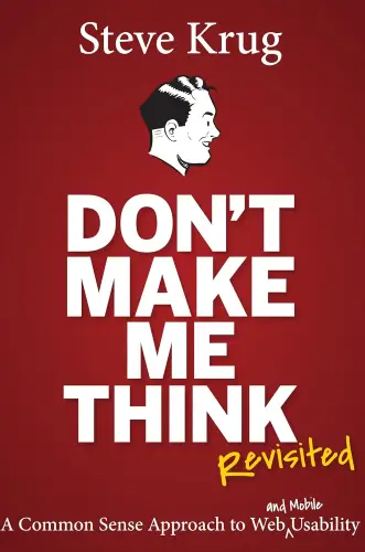
Don't Make Me Think
A Common Sense Approach to Web Usability
What's it about?
Don't Make Me Think, Revisited is a must-read for anyone involved in web design or user experience. Steve Krug's straightforward writing style makes complex concepts easy to understand. The book emphasizes the importance of designing websites that are intuitive and user-friendly, with clear navigation and minimal cognitive effort required from users. Krug's practical tips and real-world examples make it a valuable resource for improving the usability of any website.
About the Author
Steve Krug is a user experience professional best known for his book "Don't Make Me Think," which emphasizes simplicity and common sense in web usability and design. His work advocates for user-friendly interfaces and is considered essential reading for web developers and designers seeking to enhance website accessibility and usability.
10 Key Ideas of Don't Make Me Think
Create Self-Explanatory Navigation
Navigation should be intuitive and self-explanatory, allowing users to easily understand where each link will take them without having to think about it.
This involves using clear, descriptive labels for navigation elements and organizing them in a logical manner.
The reasoning behind this is that when users can navigate a website effortlessly, they are more likely to explore more content, stay on the site longer, and have a positive overall experience.
Learn DeeperUse Familiar Words in Navigation Labels: Stick to commonly understood terms for your navigation. For example, use 'Contact' instead of 'Get in Touch with Us'. This reduces the cognitive load on users.
Group Similar Items Together: Organize your navigation menu by grouping similar items under a common category. For instance, 'Shirts', 'Pants', and 'Shoes' can all fall under 'Clothing'.
Keep It Consistent Across Pages: Ensure that your navigation looks and functions the same across all pages. This helps users form a mental model of your site that they can easily follow.
Limit the Number of Items in Your Navigation: Too many choices can overwhelm users. Aim for no more than seven main items in your navigation menu. If you have more, consider using sub-menus.
Use Visual Hierarchy: Make primary navigation items more prominent than secondary ones. You can achieve this through size, color, or placement on the page.
- Example
An e-commerce website uses clear, descriptive labels such as 'Men', 'Women', 'Kids', 'Accessories', and 'Sale' in its main navigation. Each category then breaks down into sub-categories like 'Tops', 'Bottoms', and 'Footwear' for easy browsing.
- Example
A blog categorizes its content into 'Latest Posts', 'Guides', 'Reviews', and 'Interviews'. These categories are prominently displayed in the blog's header, making it easy for readers to find the type of content they're interested in.
Employ Visual Hierarchies to Highlight Important Elements
Visual hierarchies are used to guide users' attention to the most important information or actions on a page by varying the size, color, and placement of elements.
This tactic ensures that users can quickly identify key information or calls to action without being overwhelmed by less important details.
The effectiveness of visual hierarchies lies in their ability to make websites more scannable, which is crucial since users often skim rather than read every word on a page.
Learn DeeperIdentify Key Information or Actions: Start by determining what the most important pieces of information are on your website or page. This could be a call to action like 'Sign Up', 'Contact Us', or crucial content that you want your users to see first.
Use Size to Your Advantage: Make important elements larger than less important ones. For example, main headings should be noticeably larger than subheadings or body text. This draws the eye to these elements first.
Play with Colors: Use color to highlight important buttons or links. A brightly colored 'Donate Now' button on a charity website will stand out more against a neutral background, making it more likely for users to click on it.
Strategic Placement: Place key information or actions in locations where users are most likely to look first. According to the 'F-pattern' reading behavior, this is often at the top left of the screen or along the top of the page.
Simplify the Design: Remove or de-emphasize less important details that can distract from the key messages. This might mean using a simpler color scheme, fewer images, or less text to ensure the focus remains on the priority content.
- Example
On an e-commerce site, product names and prices are made bold and larger than the product descriptions to catch the user's attention quickly. A bright 'Add to Cart' button is placed directly below the price for easy access.
- Example
A non-profit organization's website uses a large, colorful banner at the top of their homepage with a concise message about their mission and a prominent 'Donate Now' button. Below the banner, in smaller text, are links to learn more about their projects and impact.
Simplify Page Design to Enhance Usability
Streamlining the design of web pages by removing unnecessary elements or content can significantly improve usability.
A clean, uncluttered layout helps users focus on what's important without distractions.
Simplification also involves grouping related items together and using ample white space to prevent cognitive overload.
This approach is based on the principle that simpler designs reduce confusion and make it easier for users to accomplish their goals.
Learn DeeperEvaluate Your Website's Content: Take a critical look at your website. Identify elements that don't serve a direct purpose or add value to the user's experience. This could be redundant features, overly complex navigation menus, or blocks of text that could be simplified.
Prioritize Clarity and Simplicity in Design: When adding or redesigning elements on your site, ask yourself if there's a simpler way to present the information. Use clear headings, bullet points for lists, and ensure that buttons or links are easy to find and understand.
Implement a Consistent Layout Across Pages: Users should not have to relearn how to navigate your site with each new page they visit. Keep navigation menus, headers, and footers consistent throughout the site to reduce cognitive load and make the site more intuitive.
Use White Space Strategically: Don't fear empty space on your web pages. White space can help reduce clutter and focus the user's attention on the most important information. It also makes your site look more professional and easier to read.
Group Related Items Together: Whether it's a list of services, product features, or related articles, grouping similar items together helps users process information more efficiently. Use sections, borders, or background colors to visually separate different groups.
- Example
A blog simplifies its homepage by reducing the number of featured articles from ten to five, focusing on quality over quantity. It uses white space around each article preview to make them stand out more and groups them under clear, descriptive categories.
- Example
An e-commerce site redesigns its product pages by removing unnecessary promotional banners, focusing on essential details like product images, descriptions, and customer reviews. It also simplifies the checkout process by reducing the number of steps and clearly marking progress indicators.
Make Clickable Elements Obvious
Users should be able to easily distinguish clickable elements, such as buttons and links, from non-clickable elements.
This can be achieved through consistent styling, such as color, underlining for links, and conventional button shapes.
Making clickable elements obvious eliminates guesswork for users, leading to a smoother navigation experience.
The rationale is that when users know exactly what to click on, they feel more confident and satisfied with their interactions.
Learn DeeperUse Consistent Styling for Clickable Elements: When designing a website or any digital interface, ensure that all clickable elements like buttons and links have a consistent look. This could mean using the same color scheme, font style, or button shape across the board.
Highlight Links with Underlining or Color Changes: Make sure that links within text are easily identifiable by underlining them or changing their color. This is a visual cue to users that the text is interactive.
Adopt Conventional Shapes for Buttons: Use shapes for buttons that users are familiar with, such as rounded rectangles. This leverages users' previous experiences with digital interfaces to guide their interactions on your site.
Provide Visual Feedback When Elements are Clicked: Implement visual feedback, such as a button changing color when clicked. This immediate response tells users that their action has been registered, reducing confusion and enhancing user satisfaction.
- Example
In a blog post, all external links are underlined and turn from blue to purple once clicked, clearly indicating which links have been visited.
- Example
On an e-commerce website, all add-to-cart buttons are bright green with a shopping cart icon, making it instantly clear where to click to add items to the shopping cart.
Minimize User Memory Load
Designing interfaces in a way that minimizes the amount of information users need to remember from one part of the interface to another enhances usability.
This can involve displaying relevant information where and when it is needed, rather than expecting users to recall it.
Reducing memory load is crucial because cognitive capacity is limited, and users should not be burdened with remembering details unnecessarily.
This approach makes interactions more intuitive and reduces errors.
Learn DeeperSimplify Navigation: Keep your website or app navigation simple and intuitive. Use familiar terms and icons so users don't have to remember what each symbol means or where they saw a particular piece of information.
Use Visual Cues: Incorporate visual cues like breadcrumbs, highlights, or color coding to help users keep track of where they are in a process or a website. This reduces the need for them to remember their steps.
Chunk Information: Break down information into smaller, manageable chunks. For instance, instead of presenting a long form on one page, divide it into sections or steps. This way, users focus on one piece of information at a time.
Provide Immediate Feedback: When users complete an action, provide immediate feedback. For example, if they submit a form, display a confirmation message. This helps users understand that their action was successful without having to remember what they did.
- Example
An e-commerce website uses a progress bar at the top of the checkout page, showing users exactly where they are in the checkout process (e.g., 'Shipping Address' -> 'Payment Details' -> 'Review & Place Order'). This visual cue helps users understand their progress without remembering each step they've completed.
- Example
A mobile app uses icons with labels at the bottom of the screen for navigation. Instead of expecting users to remember what each icon means, the labels clearly indicate the purpose (e.g., 'Home', 'Search', 'Profile'), making navigation intuitive and reducing cognitive load.
Deeper knowledge. Personal growth. Unlocked.
Unlock this book's key ideas and 15M+ more. Learn with quick, impactful summaries.
Read Full SummarySign up and read for free!
Don't Make Me Think Summary: Common Questions
Experience Personalized Book Summaries, Today!
Discover a new way to gain knowledge, and save time.
Sign up for our 7-day trial now.
No Credit Card Needed

Similar Books

$100M Offers
Alex Hormozi
Principles of Marketing, Global Edition
Gary Armstrong
The 100 Best Business Books of All Time
Jack Covert
Playing to Win
A.G. Lafley
Productize
Eisha Armstrong
Start Your Own Pet-Sitting Business and More
Entrepreneur Press
The 22 Immutable Laws of Marketing
Al Ries
The Upstarts
Brad Stone
Lean Analytics
Alistair Croll
Built to Sell
John WarrillowTrending Summaries

Peak
Anders Ericsson
Never Split the Difference
Chris Voss
Smart Brevity
Jim VandeHei
The Psychology of Money
Morgan Housel
The First 90 Days
Michael D. Watkins
Atomic Habits
James Clear
Thinking, Fast and Slow
Daniel Kahneman
The Body Keeps the Score
Bessel van der Kolk M.D.
The Power of Regret
Daniel H. Pink
The Compound Effect
Darren HardyNew Books

SCRATCH YOUR OWN ITCH: Turning Personal Needs into Purposeful Action
DR. NEERAJ TIWARI
Autobiography of a Yogi
Sri Sri Paramahansa Yogananda
Batman: The World
Various
Life in the White House
Robert P. Watson
Attention and Orienting
Peter J. Lang
Forex Trading QuickStart Guide
Troy Noonan
Comprehensive Casebook of Cognitive Therapy
Frank M. Dattilio
The White Night of St. Petersburg
Michel (Prince of Greece)
Demystifying Climate Models
Andrew Gettelman

